▲Matplotlibライブラリ
Matplotlibライブラリについて説明します。
参考
Matplotlibライブラリにはグラフを可視化するためのモジュールが含まれています。以下では、Matplotlibライブラリのモジュールを使った、グラフの基本的な描画について説明します。
Matoplotlibライブラリを使用するには、まず matplotlib のモジュールをインポートします。ここでは、基本的なグラフを描画するための matplotlib.pyplot モジュールをインポートします。慣例として、同モジュールを plt と別名をつけてコードの中で使用します。また、グラフで可視化するデータはリストや配列を用いることが多いため、5-3で使用した numpy モジュールも併せてインポートします。なお、%matplotlib inline はノートブック内でグラフを表示するために必要です。
matplotlib では、通常 show() 関数を呼ぶと描画を行いますが、inline 表示指定の場合、show() 関数を省略できます。
[1]:
import numpy as np
import matplotlib.pyplot as plt
%matplotlib inline
線グラフ
pyplot モジュールの plot() 関数を用いて、リストの要素の数値をy軸の値としてグラフを描画します。y軸の値に対応するx軸の値は、リストの各要素のインデックスとなっています。
具体的には、次のようにすることで リストA のインデックス i に対して、(i, リストA[i]) の位置に点を打ち、各点を線でつなぎます。
plt.plot(リストA)
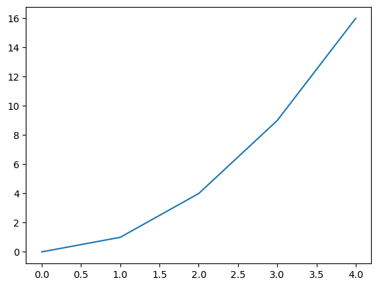
たとえば、次のようになります。
[2]:
# plotするデータ
d =[0, 1, 4, 9, 16]

# plot関数で描画
plt.plot(d);
# セルの最後に評価されたオブジェクトの出力表示を抑制するために、以下ではセルの最後の行にセミコロン (`;`) をつけています。
# 試しにセミコロンを消した場合も試してみてください。
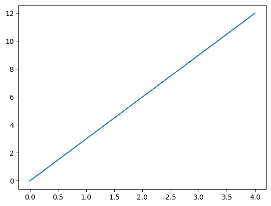
plot() 関数では、x, y の両方の軸の値を引数に渡すこともできます。
具体的には、次のように リストX と リストY を引数として与えると、各 i に対して、 (リストX[i], リストY[i]) の位置に点を打ち、各点を線でつなぎます。
plt.plot(リストX, リストY)
[3]:
# plotするデータ
x =[0, 1, 2, 3, 4]
y =[0, 3, 6, 9, 12]

# plot関数で描画
plt.plot(x,y);
リストの代わりにNumPyライブラリの配列を与えても同じ結果が得られます。
[4]:
# plotするデータ
x =[0, 1, 2, 3, 4]
aryx = np.array(x) # リストから配列を作成
y =[0, 3, 6, 9, 12]
aryy = np.array(y) # リストから配列を作成

# plot関数で描画
plt.plot(aryx, aryy);

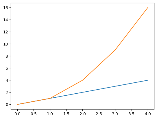
以下のようにグラフを複数まとめて表示することもできます。複数のグラフを表示すると、線ごとに異なる色が自動で割り当てられます。
[5]:
# plotするデータ
data =[0, 1, 4, 9, 16]
x =[0, 1, 2, 3, 4]
y =[0, 1, 2, 3, 4]
# plot関数で描画。
plt.plot(x, y)
plt.plot(data);
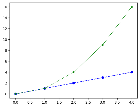
plot() 関数ではグラフの線の色、形状、データポイントのマーカの種類を、それぞれ以下のように linestyle, color, marker 引数で指定して変更することができます。それぞれの引数で指定可能な値は以下を参照してください。
[6]:
# plotするデータ
data =[0, 1, 4, 9, 16]
x =[0, 1, 2, 3, 4]
y =[0, 1, 2, 3, 4]

# plot関数で描画。線の形状、色、データポイントのマーカ指定
plt.plot(x,y, linestyle='--', color='blue', marker='o')
plt.plot(data, linestyle=':', color='green', marker='*');
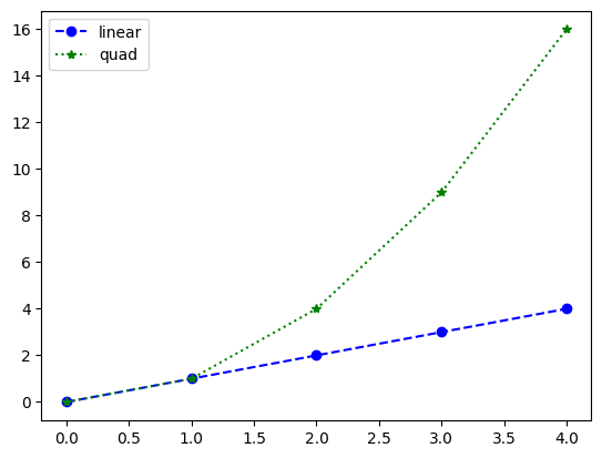
plot() 関数の label 引数にグラフの各線の凡例を文字列として渡し、legend() 関数を呼ぶことで、グラフ内に凡例を表示できます。legend() 関数の loc 引数で凡例を表示する位置を指定することができます。引数で指定可能な値は以下を参照してください。
[7]:
# plotするデータ
data =[0, 1, 4, 9, 16]
x =[0, 1, 2, 3, 4]
y =[0, 1, 2, 3, 4]

# plot関数で描画。線の形状、色、データポイントのマーカ指定
plt.plot(x,y, linestyle='--', color='blue', marker='o', label='linear')
plt.plot(data, linestyle=':', color='green', marker='*', label='quad')
#凡例を表示
plt.legend();
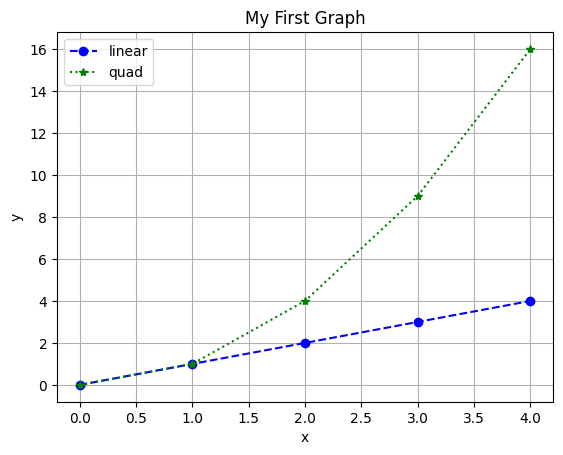
pyplot モジュールでは、以下のようにグラフのタイトルと各軸のラベルを指定して表示することができます。タイトル、x軸のラベル、y軸のラベル、はそれぞれ title() 関数、xlabel() 関数、ylabel() 関数に文字列を渡して指定します。また、grid() 関数を用いるとグリッドを併せて表示することもできます。グリッドを表示させたい場合は、grid() 関数に True を渡してください。
[8]:
# plotするデータ
data =[0, 1, 4, 9, 16]
x =[0, 1, 2, 3, 4]
y =[0, 1, 2, 3, 4]

# plot関数で描画。線の形状、色、データポイントのマーカ、凡例を指定
plt.plot(x,y, linestyle='--', color='blue', marker='o', label='linear')
plt.plot(data, linestyle=':', color='green', marker='*', label='quad')
plt.legend()

plt.title('My First Graph') # グラフのタイトル
plt.xlabel('x') #x軸のラベル
plt.ylabel('y') #y軸のラベル
plt.grid(True); #グリッドの表示
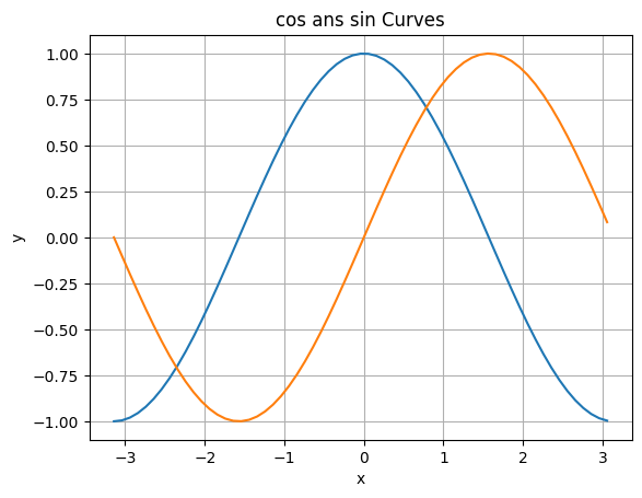
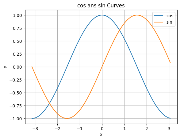
グラフを描画するときのプロット数を増やすことで任意の曲線のグラフを作成することもできます。以下では、numpy モジュールの arange() 関数を用いて、\(- \pi\) から \(\pi\) の範囲を 0.1 刻みでx軸の値を配列として準備しています。そのx軸の値に対して、numpy モジュールの cos() 関数と sin() 関数を用いて、y軸の値をそれぞれ準備し、cosカーブとsinカーブを描画しています。
[9]:
# グラフのx軸の値となる配列
x = np.arange(-np.pi, np.pi, 0.1)

# 上記配列をcos, sin関数に渡し, y軸の値として描画
plt.plot(x,np.cos(x))
plt.plot(x,np.sin(x))

plt.title('cos ans sin Curves')  # グラフのタイトル
plt.xlabel('x') #x軸のラベル
plt.ylabel('y') #y軸のラベル
plt.grid(True); #グリッドの表示
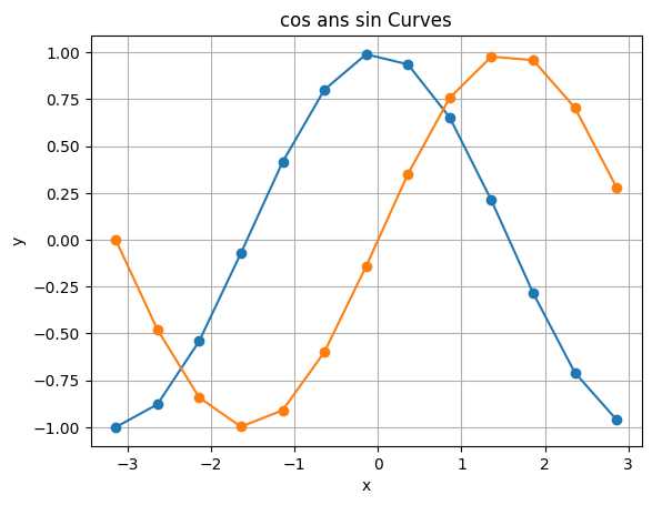
プロットの数を少なくすると、曲線は直線をつなぎ合わせることで描画されていることがわかります。
[10]:
x = np.arange(-np.pi, np.pi, 0.5)
plt.plot(x,np.cos(x), marker='o')
plt.plot(x,np.sin(x), marker='o')
plt.title('cos ans sin Curves')
plt.xlabel('x')
plt.ylabel('y')
plt.grid(True);
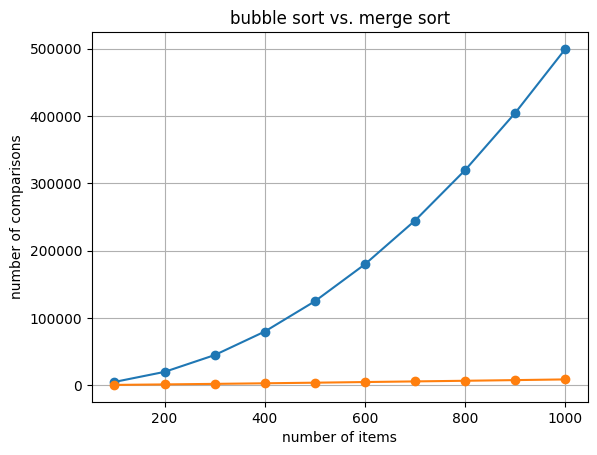
グラフの例:ソートアルゴリズムにおける比較回数
[11]:
import random

def bubble_sort(lst):
    n = 0
    for j in range(len(lst) - 1):
        for i in range(len(lst) - 1 - j):
            n = n + 1
            if lst[i] > lst[i+1]:
                lst[i + 1], lst[i] = lst[i], lst[i+1]
    return n

def merge_sort_rec(data, l, r, work):
    if l+1 >= r:
        return 0
    m = l+(r-l)//2
    n1 = merge_sort_rec(data, l, m, work)
    n2 = merge_sort_rec(data, m, r, work)
    n = 0
    i1 = l
    i2 = m
    for i in range(l, r):
        from1 = False
        if i2 >= r:
            from1 = True
        elif i1 < m:
            n = n + 1
            if data[i1] <= data[i2]:
                from1 = True
        if from1:
            work[i] = data[i1]
            i1 = i1 + 1
        else:
            work[i] = data[i2]
            i2 = i2 + 1
    for i in range(l, r):
        data[i] = work[i]
    return n1+n2+n

def merge_sort(data):
    return merge_sort_rec(data, 0, len(data), [0]*len(data))
[12]:
x = np.arange(100, 1100, 100)
bdata = np.array([bubble_sort([random.randint(1,10000) for i in range(k)]) for k in x])
mdata = np.array([merge_sort([random.randint(1,10000) for i in range(k)]) for k in x])
[13]:
plt.plot(x, bdata, marker='o')
plt.plot(x, mdata, marker='o')
plt.title('bubble sort vs. merge sort')
plt.xlabel('number of items')
plt.ylabel('number of comparisons')
plt.grid(True);
練習
-2 から 2 の範囲を 0.1 刻みでx軸の値を配列として作成し、そのx軸の値に対して numpy モジュールの exp() 関数を用いてy軸の値を作成し、\(y=e^{x}\) のグラフを描画する関数 plot_exp を作成してください。ただし、そのグラフに任意のタイトル、x軸、y軸の任意のラベル、任意の凡例、グリッドを表示させてください。
[14]:
import ...
...
def plot_exp():
    ...
  Cell In[14], line 1
    import ...
           ^
SyntaxError: invalid syntax
上のセルで解答を作成した後、以下のセルを実行し、実行結果が全て True になることを確認してください。
[15]:
res_x = plot_exp()
print(len(res_x) == 41, int(res_x[0]) == -2, int(res_x[9]) == -1)
---------------------------------------------------------------------------
NameError                                 Traceback (most recent call last)
Cell In[15], line 1
----> 1 res_x = plot_exp()
      2 print(len(res_x) == 41, int(res_x[0]) == -2, int(res_x[9]) == -1)

NameError: name 'plot_exp' is not defined
練習
4-csvで説明したように、tokyo-temps.csv には、気象庁のオープンデータからダウンロードした、東京の平均気温のデータが入っています。具体的には、各行の第2列に気温の値が格納されており、47行目に1875年6月の、48行目に1875年7月の、…、53行目に1875年12月の、54行目に1876年1月の、…という風に2017年1月のデータまでが格納されています。
そこで、2つの整数 year と month を引数として取り、 year 年以降の month 月の平均気温の値をy軸に、年をx軸に描画した線グラフを表示するとともに、描画したx軸とy軸の値をタプルに格納して返す関数 plot_tokyotemps を作成してください。
以下のセルの ... のところを書き換えて解答してください。
[16]:
import ...
...
def plot_tokyotemps(year, month):
    ...
  Cell In[16], line 1
    import ...
           ^
SyntaxError: invalid syntax
上のセルで解答を作成した後、以下のセルを実行し、実行結果が全て True になることを確認してください。
[17]:
res_years, res_temps = plot_tokyotemps(1875, 7)
print(len(res_years) == 142, len(res_temps) == 142, res_years[0] == 1875, res_temps[0] == 26.0)
res_years, res_temps = plot_tokyotemps(1875, 6)
print(len(res_years) == 142, len(res_temps) == 142, res_years[0] == 1875, res_temps[0] == 22.3)
res_years, res_temps = plot_tokyotemps(1875, 12)
print(len(res_years) == 142, len(res_temps) == 142, res_years[0] == 1875, res_temps[0] == 4.6)
res_years, res_temps = plot_tokyotemps(1876, 1)
print(len(res_years) == 142, len(res_temps) == 142, res_years[0] == 1876, res_temps[0] == 1.6)
res_years, res_temps = plot_tokyotemps(1876, 6)
print(len(res_years) == 141, len(res_temps) == 141, res_years[0] == 1876, res_temps[0] == 18.5)
res_years, res_temps = plot_tokyotemps(1900, 6)
print(len(res_years) == 117, len(res_temps) == 117, res_years[0] == 1900, res_temps[0] == 19.3)
---------------------------------------------------------------------------
NameError                                 Traceback (most recent call last)
Cell In[17], line 1
----> 1 res_years, res_temps = plot_tokyotemps(1875, 7)
      2 print(len(res_years) == 142, len(res_temps) == 142, res_years[0] == 1875, res_temps[0] == 26.0)
      3 res_years, res_temps = plot_tokyotemps(1875, 6)

NameError: name 'plot_tokyotemps' is not defined
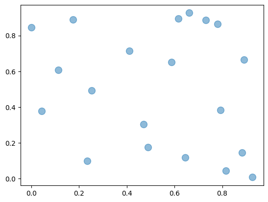
散布図
散布図は、pyplot モジュールの scatter() 関数を用いて描画できます。
具体的には、次のように リストX と リストY (もしくは、 配列X と 配列Y)を引数として与えると、各 i に対して、 (リストX[i], リストY[i]) の位置に点を打ちます。
plt.scatter(リストX, リストY)
以下では、ランダムに生成した20個の要素からなる配列 x, y の各要素の値の組を点としてプロットした散布図を表示しています。プロットする点のマーカの色や形状は、線グラフの時と同様に、 color, marker 引数で指定して変更することができます。加えて、s, alpha 引数で、それぞれマーカの大きさと透明度を指定することができます。
[18]:
# グラフのx軸の値となる配列
x = np.random.rand(20)
# グラフのy軸の値となる配列
y = np.random.rand(20)

# scatter関数で散布図を描画
plt.scatter(x, y, s=100, alpha=0.5);
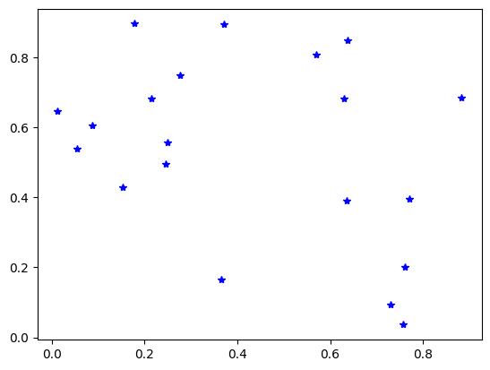
以下のように、plot() 関数を用いても同様の散布図を表示することができます。具体的には、3番目の引数にプロットする点のマーカの形状を指定することにより実現します。
[19]:
x = np.random.rand(20)
y = np.random.rand(20)
plt.plot(x, y, '*', color='blue');
練習
tokyo-temps.csv には、気象庁のオープンデータからダウンロードした、東京の平均気温のデータが入っています。具体的には、各行の第2列に気温の値が格納されており、47行目に1875年6月の、48行目に1875年7月の、…、53行目に1875年12月の、54行目に1876年1月の、…という風に2017年1月のデータまでが格納されています。
そこで、1875年以降の平均気温の値をy軸に、月の値をx軸に描画した散布図を表示するとともに、描画したx軸とy軸の値をタプルに格納して返す関数 scatter_tokyotemps を作成してください。
以下のセルの ... のところを書き換えて解答してください。
[20]:
import ...
...
def scatter_tokyotemps():
    ...
  Cell In[20], line 1
    import ...
           ^
SyntaxError: invalid syntax
上のセルで解答を作成した後、以下のセルを実行し、実行結果が全て True になることを確認してください。
[21]:
res_months, res_temps = scatter_tokyotemps()
print(len(res_months) == 1700, len(res_temps) == 1700, res_months[0] == 6, res_months[1] == 7, res_months[12] == 6, res_months[13] == 7)
print(res_temps[0] == 22.3, res_temps[1] == 26.0, res_temps[12] == 18.5, res_temps[13] == 24.3)
---------------------------------------------------------------------------
NameError                                 Traceback (most recent call last)
Cell In[21], line 1
----> 1 res_months, res_temps = scatter_tokyotemps()
      2 print(len(res_months) == 1700, len(res_temps) == 1700, res_months[0] == 6, res_months[1] == 7, res_months[12] == 6, res_months[13] == 7)
      3 print(res_temps[0] == 22.3, res_temps[1] == 26.0, res_temps[12] == 18.5, res_temps[13] == 24.3)

NameError: name 'scatter_tokyotemps' is not defined
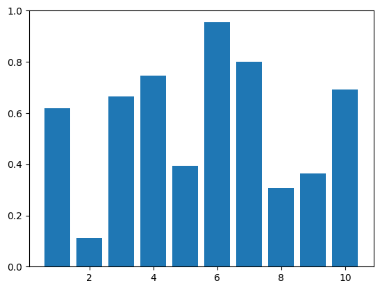
棒グラフ
棒グラフは、pyplot モジュールの bar() 関数を用いて描画できます。以下では、ランダムに生成した10個の要素からなる配列 y の各要素の値を縦の棒グラフで表示しています。x は、x軸上で棒グラフのバーの並ぶ位置を示しています。ここでは、numpy モジュールの arange() 関数を用いて、1 から 10 の範囲を 1 刻みでx軸上のバーの並ぶ位置として配列を準備しています。
[22]:
# x軸上で棒の並ぶ位置となる配列
x = np.arange(1, 11, 1)
# グラフのy軸の値となる配列
y = np.random.rand(10)

# bar関数で棒グラフを描画
#print(x, y)
plt.bar(x,y);
練習
tokyo-temps.csv には、気象庁のオープンデータからダウンロードした、東京の平均気温のデータが入っています。具体的には、各行の第2列に気温の値が格納されており、47行目に1875年6月の、48行目に1875年7月の、…、53行目に1875年12月の、54行目に1876年1月の、…という風に2017年1月のデータまでが格納されています。
そこで、4つの引数 year1, month1, year2, month2 を引数に取り、 year1 年 month1 月から year2 年 month2 月までの各月の平均気温の値をy軸に、年月の値(tokyo-temps.csv の1列目の値)をx軸に描画した棒グラフを表示するとともに、描画したx軸とy軸の値をタプルに格納して返す関数 bar_tokyotemps を作成してください。
以下のセルの ... のところを書き換えて解答してください。
[23]:
import ...
...
def bar_tokyotemps(year1, month1, year2, month2):
    ...
  Cell In[23], line 1
    import ...
           ^
SyntaxError: invalid syntax
上のセルで解答を作成した後、以下のセルを実行し、実行結果が全て True になることを確認してください。
[24]:
res_months, res_temps = bar_tokyotemps(2000, 6, 2001, 6)
print(len(res_months) == 13, res_months[0] == '2000/6', res_temps[0] == 22.5, res_months[12] == '2001/6', res_temps[12] == 23.1)
---------------------------------------------------------------------------
NameError                                 Traceback (most recent call last)
Cell In[24], line 1
----> 1 res_months, res_temps = bar_tokyotemps(2000, 6, 2001, 6)
      2 print(len(res_months) == 13, res_months[0] == '2000/6', res_temps[0] == 22.5, res_months[12] == '2001/6', res_temps[12] == 23.1)

NameError: name 'bar_tokyotemps' is not defined
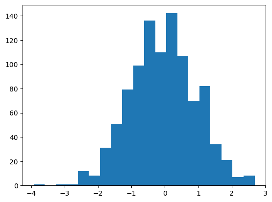
ヒストグラム
ヒストグラムは、pyplot モジュールの hist() 関数を用いて描画できます。 以下では、numpy モジュールの random.randn() 関数を用いて、正規分布に基づく1000個の数値の要素からなる配列を用意し、ヒストグラムとして表示しています。 hist() 関数の bins 引数でヒストグラムの箱(ビン)の数を指定します。
[25]:
# 正規分布に基づく1000個の数値の要素からなる配列
d = np.random.randn(1000)

# hist関数でヒストグラムを描画
plt.hist(d, bins=20);
練習
tokyo-temps.csv には、気象庁のオープンデータからダウンロードした、東京の平均気温のデータが入っています。具体的には、各行の第2列に気温の値が格納されており、47行目に1875年6月の、48行目に1875年7月の、…、53行目に1875年12月の、54行目に1876年1月の、…という風に2017年1月のデータまでが格納されています。
そこで、5つの引数 year1, month1, year2, month2, mybin を引数に取り、 year1 年 month1 月から year2 年 month2 月までの各月の平均気温の値を格納したリスト temps から mybin 個のヒストグラムを表示するとともに、 temps を返す関数 hist_tokyotemps を作成してください。
以下のセルの ... のところを書き換えて解答してください。
[26]:
import ...
...
def hist_tokyotemps(year1, month1, year2, month2, mybin):
    ...
  Cell In[26], line 1
    import ...
           ^
SyntaxError: invalid syntax
上のセルで解答を作成した後、以下のセルを実行し、実行結果が全て True になることを確認してください。
[27]:
res_temps = hist_tokyotemps(1875, 6, 2000, 6, 50)
print(len(res_temps) == 1501, res_temps[0] == 22.3, res_temps[1500] == 22.5)
---------------------------------------------------------------------------
NameError                                 Traceback (most recent call last)
Cell In[27], line 1
----> 1 res_temps = hist_tokyotemps(1875, 6, 2000, 6, 50)
      2 print(len(res_temps) == 1501, res_temps[0] == 22.3, res_temps[1500] == 22.5)

NameError: name 'hist_tokyotemps' is not defined
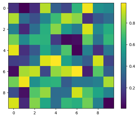
ヒートマップ
impshow() 関数を用いると、以下のように行列の要素の値に応じて色の濃淡を変えることで、行列をヒートマップとして可視化することができます。colorbar() 関数は行列の値と色の濃淡の対応を表示します。
[28]:
# 10行10列のランダム要素からなる行列
ary1 = np.random.rand(100)
ary2 = ary1.reshape(10,10)
#ary2 = np.random.rand(100).reshape(10,10) #と同じ

# imshow関数でヒートマップを描画
im=plt.imshow(ary2)
plt.colorbar(im);
練習
tokyo-temps.csv には、気象庁のオープンデータからダウンロードした、東京の平均気温のデータが入っています。具体的には、各行の第2列に気温の値が格納されており、47行目に1875年6月の、48行目に1875年7月の、…、53行目に1875年12月の、54行目に1876年1月の、…という風に2017年1月のデータまでが格納されています。
そこで、30×12のNumPyの配列 ary1 を作成し、各月の平均気温を整数に丸めた値を求めて、月ごとにその値の数を数えて配列 ary1 に格納して、 ary1 からなるヒートマップを表示しつつ、 ary1 を返す関数 heat_tokyotemps を作成してください。 ただし、厳密には x が 0 以上 11 以下の任意の整数とし、y を 0 以上 29 以下の整数とするとき、 ary1[y][x] には、 y ℃以上、 y+1 ℃より小さい平均気温を持つ x+1 月の数が格納されているものとします。
以下のセルの ... のところを書き換えて解答してください。
[29]:
import ...
...
def heat_tokyotemps():
    ...
  Cell In[29], line 1
    import ...
           ^
SyntaxError: invalid syntax
上のセルで解答を作成した後、以下のセルを実行し、実行結果が全て True になることを確認してください。
[30]:
ary1 = heat_tokyotemps()
print(ary1[0][0] == 2, ary1[1][1] == 2, ary1[2][0] == 28)
#画像の向きが気になる人は、以下の2行を同時に実行してみてください
#ary1 = np.flip(ary1, axis=0)
#im=plt.imshow(ary1)
---------------------------------------------------------------------------
NameError                                 Traceback (most recent call last)
Cell In[30], line 1
----> 1 ary1 = heat_tokyotemps()
      2 print(ary1[0][0] == 2, ary1[1][1] == 2, ary1[2][0] == 28)
      3 #画像の向きが気になる人は、以下の2行を同時に実行してみてください
      4 #ary1 = np.flip(ary1, axis=0)
      5 #im=plt.imshow(ary1)

NameError: name 'heat_tokyotemps' is not defined
グラフの画像ファイル出力
savefig() 関数を用いると、以下のように作成したグラフを画像としてファイルに保存することができます。
[31]:
x = np.arange(-np.pi, np.pi, 0.1)
plt.plot(x,np.cos(x), label='cos')
plt.plot(x,np.sin(x), label='sin')
plt.legend()
plt.title('cos ans sin Curves')
plt.xlabel('x')
plt.ylabel('y')
plt.grid(True)

# savefig関数でグラフを画像保存
plt.savefig('cos_sin.png');
練習の解答
[32]:
import numpy as np
import matplotlib.pyplot as plt
%matplotlib inline

def plot_exp():
    x = np.arange(-2, 2.1, 0.1)
    y = np.exp(x)
    plt.plot(x, y, linestyle='--', color='blue', marker='x', label='exp(x)')
    plt.title('y = exp(x)') # タイトル
    plt.xlabel('x') # x軸のラベル
    plt.ylabel('exp(x)') # y軸のラベル
    plt.grid(True); # グリッドを表示
    plt.legend() # 盆例を表示
    return x
[33]:
import numpy as np
import matplotlib.pyplot as plt
%matplotlib inline
import csv

def plot_tokyotemps(year, month):
    with open('tokyo-temps.csv', 'r', encoding='sjis') as f:
        dataReader = csv.reader(f) # csvリーダを作成
        n=0
        # 1875年6月が47行目なので、指定されたyear年6月のデータの行番号をまず求める
        init_row = (year - 1875) * 12 + 47
        # その上で、year年month月のデータの行番号を求める
        init_row = init_row + month - 6
        years = [] # 年
        temps = [] # 平均気温
        for row in dataReader: # CSVファイルの中身を1行ずつ読み込み
            n = n+1
            if n >= init_row and (n - init_row) % 12 == 0: # init_row行目からはじめて12か月ごとにif内を実行
                years.append(year)
                temp = float(row[1]) # float関数で実数のデータ型に変換する
                temps.append(temp)
                year = year + 1
    #print(years)
    #print(temps)
    plt.plot(years, temps)
    return years, temps
[34]:
import numpy as np
import matplotlib.pyplot as plt
%matplotlib inline
import csv

def scatter_tokyotemps():
    with open('tokyo-temps.csv', 'r', encoding='sjis') as f:
        dataReader = csv.reader(f) # csvリーダを作成
        n=0
        months = [] # 月
        temps = [] # 平均気温
        month = 6 # 47行目は6月
        for row in dataReader: # CSVファイルの中身を1行ずつ読み込み
            n = n+1
            if n >= 47: # 47行目からif内を実行
                months.append(month)
                temp = float(row[1]) # float関数で実数のデータ型に変換する
                temps.append(temp)
                month = month + 1
                if month > 12:
                    month = 1
    #print(months)
    #print(temps)
    plt.scatter(months, temps, alpha=0.5)
    return months, temps
[35]:
import numpy as np
import matplotlib.pyplot as plt
%matplotlib inline
import csv

def bar_tokyotemps(year1, month1, year2, month2):
    with open('tokyo-temps.csv', 'r', encoding='sjis') as f:
        dataReader = csv.reader(f) # csvリーダを作成
        n=0
        months = [] #
        temps = [] # 平均気温
        init_row = (year1 - 1875) * 12 - 6 + month1 + 47
        end_row = (year2 - 1875) * 12 - 6 + month2 + 47
        for row in dataReader: # CSVファイルの中身を1行ずつ読み込み
            n = n+1
            if n >= init_row and n <= end_row: # init_row行目から、end_row行までif内を実行
                months.append(row[0])
                temp = float(row[1]) # float関数で実数のデータ型に変換する
                temps.append(temp)
    #print(months)
    #print(temps)
    plt.bar(months, temps)
    return months, temps
[36]:
import numpy as np
import matplotlib.pyplot as plt
%matplotlib inline
import csv

def hist_tokyotemps(year1, month1, year2, month2, mybin):
    with open('tokyo-temps.csv', 'r', encoding='sjis') as f:
        dataReader = csv.reader(f) # csvリーダを作成
        n=0
        months = [] #
        temps = [] # 平均気温
        init_row = (year1 - 1875) * 12 - 6 + month1 + 47
        end_row = (year2 - 1875) * 12 - 6 + month2 + 47
        for row in dataReader: # CSVファイルの中身を1行ずつ読み込み
            n = n+1
            if n >= init_row and n <= end_row: # init_row行目から、end_row行までif内を実行
                temp = float(row[1]) # float関数で実数のデータ型に変換する
                temps.append(temp)
    #print(months)
    #print(temps)
    plt.hist(temps, bins=mybin)
    return temps
[37]:
import numpy as np
import matplotlib.pyplot as plt
%matplotlib inline
import csv

def heat_tokyotemps():
    ary1 = np.zeros(30*12, dtype=int) # 30×12の配列を作成
    ary1 = ary1.reshape(30, 12)
    with open('tokyo-temps.csv', 'r', encoding='sjis') as f:
        dataReader = csv.reader(f) # csvリーダを作成
        n=0
        month = 6 # 一番最初の月(47行目)は6月
        for row in dataReader: # CSVファイルの中身を1行ずつ読み込み
            n = n+1
            if n >= 47: # 47行目からif内を実行
                temp = int(float(row[1])) # まずfloat関数で実数型に変換してから、int関数で整数のデータ型に変換する
                ary1[temp][month-1] += 1 # month月の値はmonth-1行目に格納する
                month += 1
                if month == 13:
                    month = 1
    im=plt.imshow(ary1)
    plt.colorbar(im);
    #print(ary1)
    return ary1